Friday, 16 June 2017

Update XI: Haqqislam Forces, Test Schemes, and Chipping Experiments

Hello friends!

It's been a little under two months since my last update so I thought I'd let you know what I've been up to hobby-wise since the start of May.

1. Finished getting my Infinity JSA army tabletop-ready.

First I focused on finishing the bases and getting an airbrush and some base layers down on the two remaining models for my JSA forces. With a layer of varnish these two were up to snuff with the rest of the army and ready to use on the tabletop while I finished their brushwork.

My Oniwaban proved to be an incredibly effective attacker in my first two games with him. Really cool high-risk/high-reward unit!
However instead of being satisfied with my JSA army and getting down to finishing them off with brushwork I instead completely shifted gears and began assembling and prepping a non-sectorial (aka 'vanilla') Haqqislam force.

Even now it's entirely unclear to me why I did this beyond liking the faction and having the Red Veil forces available to me. I really am a glutton for punishment...

2. Assembled and started prepping a Haqqislam army for the tabletop.

I supplemented the red veil box with a box of naffatuns and this, in tandem with the Knauf mercenary sniper I got with the recent infinity Manga, will make a solid 300 point Haqq list. However it added about thirteen more figures to paint on top of my eleven JSA units.

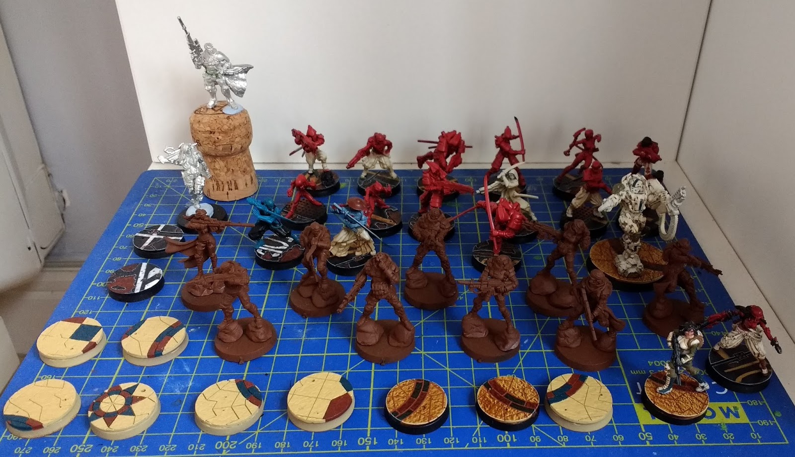
The current painting backlog, about 24 figures. :/
Consequently instead of having one finished army I now have two partially finished ones and lots of brushwork to do. Thankfully the Haqq bases are now almost entirely done and the figures are airbrushed so at least I'll be able to use both on the tabletop.

3. Initial models for both JSA and Haqqislam armies

Once I settle on a color scheme for an army I always get an initial test model to at least 70% completion with the colors I've chosen so i'm aware of any particular challenges that the combination of paints or colors might offer me. For my Haqqislam forces this was a female Ghulam line trooper.

Initial basecolors down over a completed base. I've uploaded a detailed basing tutorial seen here.
Haqqislam troops look somewhat less "high-tech" than other factions and I wanted to use earthy tones to reflect that realism while still keeping the colours bright and punchy on the tabletop. I settled on cream-coloured armour with green clothing  accompanied by some dark blue spot colours.

Working on this model proved really useful, particularly in regards to how to approach the cream armor, as I realised that doing white zenithal highlights on the airbrush beforehand was a pointless step. Definitely a time saver in the long run!

I also made my first attempt at doing a really simple NMM effect with two shades of metal over the black basecoat on the weapon. I am SO pleased with the result, which actually a lot faster than doing a full bascoat of true metal. This is probably the first time I've felt like my metal tones look good.
The current state of the model after further work. Armor and weapon are basically finished here but the skin, green, and blue have all yet to have any highlight/shading.
Rear view.
I'm definitely really pleased with the overall effect of my color scheme and it's been a lot of fun to paint.

I had already got to this point with a JSA test model, but continued to work on the Doctor figure in order to finalise my approach. I'm only somewhat happy with the result but this told me a couple things about the process that i'll keep in mind for the remaining figures. Specifically how to approach highlighting the puffy pants and also that the red armour doesn't really need a glaze to get the most out of it.

Front view. Armor, weapon, and pants pretty much done here. Skin, hair, and brown spot colors need a lot more stuff going on .Haven't evne gotten around to base coating some of the straps yet.
rear view
4. Chipping experiment on Haqqislam Heavy Infantry

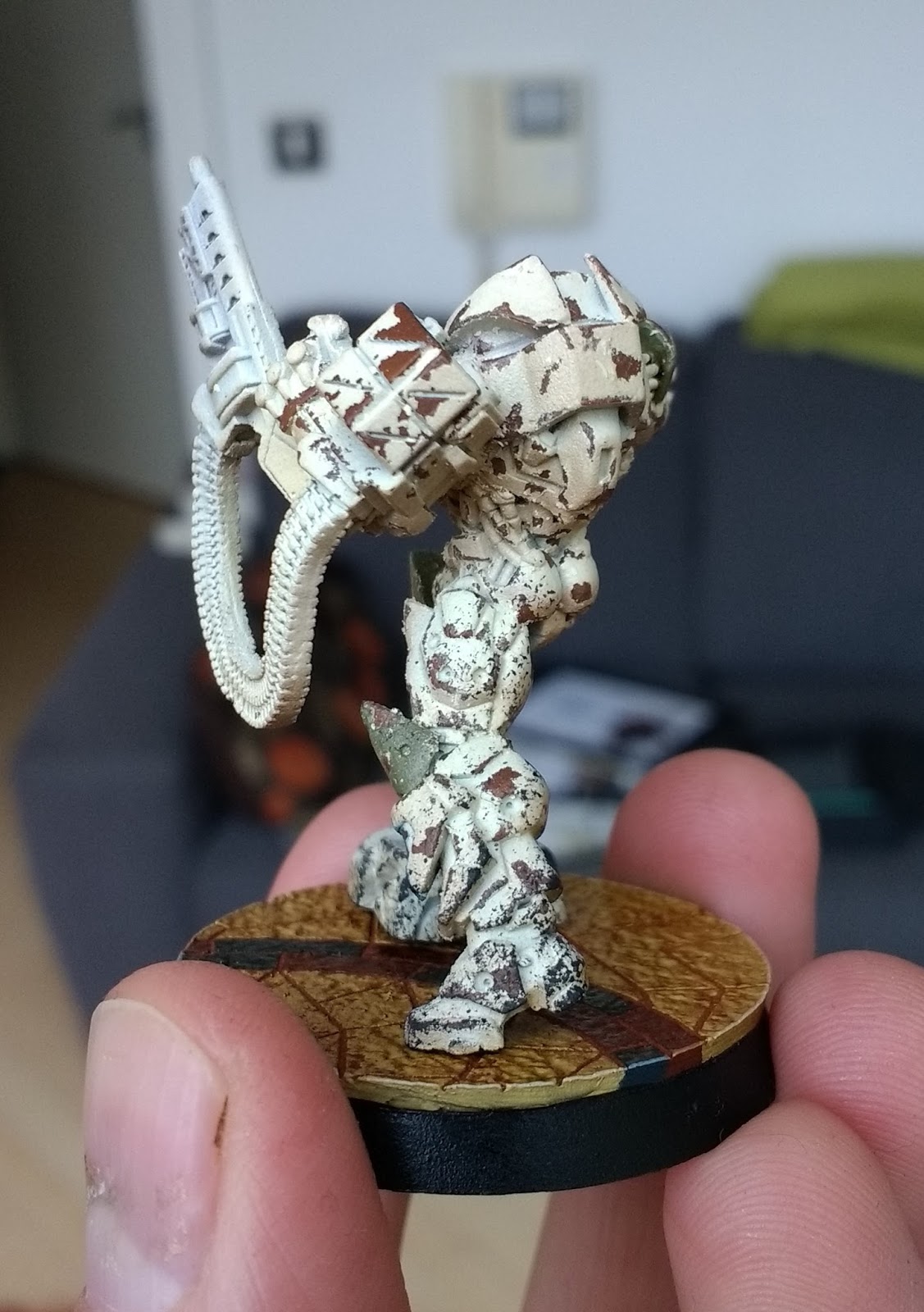
One of the Haqqislam units from the Red Veil box is encased head-to-toe in armour, and I wanted to try something different to set him apart from the others. I decided to use some chipping medium to give him a really weathered look as I'd done on my Gorkanaut around this time last year.

I won't go through a detailed step by step process but I undercoated him with a rattlecan, then sprayed him down with "doombull brown" through the airbrush. I varnished that layer, and then gave it two coats of Vallejo's "Chipping Medium" which comes in a dropper bottle.

Over the chipping medium I airbrushed him with the cream colour from my colour scheme, along with some basic airbrush zenithal shading and highlighting.

How he looked before I started chipping.
I did some spot colors using the greens and blues from the rest of color scheme to add some flavor, and then began the chipping process.

I started using water and a toothpick to chip away at the top layer. However I quickly became very frustrated with the way the Vallejo "chipping medium" behaved.

With the Gorkanaut I had used AK interactive "Worn Effect", which is used the exact same way as chipping medium. However the AK interactive effect has a lot more grip, and while it takes a lot more effort to remove the top layer of paint, it gives you lots of tiny chips which makes for a really realistic rust effect. I ended up using a toothbrush to rub down my Gorkanaut and I was really pleased with the effect.

Unfortunately with the Vallejo chipping medium it was way easier to take off the top layer, so that my initial use of a toothbrush took off almost all of the colour on the side of his right leg. It was very frustrating and upsetting. After letting it dry and fixing up the leg as best I could withe some sponging I stuck to using a toothpick and carefully picked off large flakes of the armour. The takeaway here is that Chipping medium gives you very big chips.

The result doesn't look very natural and makes him look "spotted" rather than actually worn down from use. I can see chipping like this looking fine on tanks, but on an infantry model at this scale you really need to use something else if you want a realistic worn effect with lots of little chips. Another possible solution is to only use one layer of chipping medium rather than two, and also spending more time in the chipping process to get it looking more natural. I admit I was so disappointed I sort of rushed this a bit.

The same model after the initial chips, note the fixes on the side of his right leg from where I took off too much of the top layer.
Thankfully this guy isn't my favourite model ever and I don't expect he'll be getting a ton of table time once my forces expand, so I was happy to just say "lesson learned" and move on. I did give him a bit of sponge weathering before gluing him to his base, and I plan to give him some oil washes which will help tie in the overall look and make things a lot more natural.
After some sponging on the legs and being glued to his base.
Rear view.
Front view. It looks quite sloppy here but once the details are picked out it will look a lot more cohesive.
I'm looking forward to doing something similar with Haqqislam's other heavy infantry unit but using the AK interactive effect rather than Vallejo. I expect it will look much much better!

5. Played some games!

I've actually been playing Infinity quite regularly at my local and I'm really pleased that my hobby work is being used on the tabletop so frequently! There's currently a large casual campaign being run by Corvus Belli and Beasts of War called "Strikezone Wotan" that is really encouraging people to get out and play. People upload battle reports for various theatres of war which impact the overall narrative of the campaign!

I represent the Yu Jing forces with my Japanese army sectorial and you can check out my battle reports and profile here.


Well with that you're all caught up on my hobby times. Thanks so much for looking! 😄

Monday, 24 April 2017

Update X: Japanese Sectorial Army for Infinity

Hello friends,

Further progress has been made on my JSA infinity force so that most of them are now mounted on their bases and ready to actually get some games in. I'd promised myself not to play with unpainted figures but the severely limited amount of hobby time I have available has forced me to alter that stance somewhat. I have completed the airbrushed basecoats and highlights on the figures, and I've fully completed their bases, so I'm about half-finished everything.

The bases in question are 25mm Micro Art Studio "Warehouse" bases available here. I really love the quality on these and I had a ton of fun working on them even though I sort of made things up as I went along. I've used a combination of "road themed" MDF cardboard stencils and Vallejo "Burnt Sienna" pigment to get some fun effects going that have made them really dynamic.
I purposely aimed to keep the tones either neutral or warm with the hints of yellow/red in order to complement the warm parchment/red palette of my troops. Hopefully it should all look relatively cohesive once I have the detail work on the troops finished, which will include a lot of browns.
Some airbrush work on a section of the base that emphasizes the warm tone I was going for.
All of the bases ready to be mounted, apologies for the poor lighting.
From here I mounted all of my airbrushed figures to their respective bases, as it will be exclusively traditional brushwork from here on out.

It should be noted that I have given a satin varnish layer to both the miniatures and the bases in order to protect my work. I can't emphasise enough how useful a layer of varnish is to the painting process for these reasons:

  1. To avoid taking paint off as I continue to work with them. I don't want the natural oils in my hands or the friction of handling to remove finished sections.
  2. To allow them to be used on the tabletop. If you want to play with partially painted figures you had better varnish them so as not to risk losing or damaging your work. This goes double for Infinity figures as they are all metal.
  3. To make it easy to fix painting mistakes. The varnish layer means that any accidents or sloppy moments I have in picking out the details can be corrected easily using a mild paint thinner. The thinner will remove the problem area but not go through the varnish layer underneath and ruin what I've already done.

Above are some close-ups of how the figures look at the moment. The airbrush highlighting/shading is done, and the bases are complete, so all that's needed now is some brushwork to pick out the details.
Here's a picture of the whole army so far. Two of the troops in the back were test models, and two have only recently reached the assembled state but I'm nearly there. Once I've got the latter based properly this should form a relatively viable 300 point all-comers list that I can start fielding regularly.


List ahoy! Miyamoto Mushashi and the Oniwaban are the only models not tabletop ready yet.
In the meantime I have continued to play infinity at the North West Gaming centre. I'm definitely starting to get a feel for the game again, and I'm beginning to come back from my initial run of losses. These are still really casual games against relatively beginner opponents but we're definitely starting to explore how dynamic the system can be. It helps that we've started doing more scenarios as well!

Here are some pictures from my last game in which I took my Aleph forces against a Shasvastii-heavy vanilla Combined Army force. We were playing the Quadrant Control ITS scenario that lets you hold quarters of the table with point costs. My opponent won initiative and chose deployment with a very favourable table-side that gave him lots of great spots for his extensive infiltrating camouflage troops. However even with no MSV on my team I was able to push my way up the left flank with Achilles and a myrmidon buddy under the careful supervision of a Sophotect doctor. The game started poorly for me but I ended up winning the scenario quite thanks to a strong left flank and me (eventually) dealing with some of my opponents threats.

The game board, note the TO camo sniper in the top right and the total reaction HMG drone on the left. Brutal ARO potential from my opponent.
My first time fighting against an impersonator and it was not fun. This mono-filament lady took out my Chain of Command Myrmidon Officer before re-disguising herself and causing this ruckus. I eventually managed to take her out with a combi rifle Deva but she was extremely disruptive.

By using the cover of the corridor Achilles and his buddy were able to push into another quadrant and simply refused to move or go down. I felt a little dirty leaning on him so much, but I figure I'll eventually get rid of my Cutter/Achilles crutch once I start playing my JSA forces.

Finally in other news a brand-new edition for 40k has been announced! It's long overdue and I'm really really excited at a streamlined AoS-like update for the 40k ruleset. It is desperately needed at this point, and I'm looking forward to getting my Orks onto the table again. However I don't think anything will match how dynamic the games of Infinity I've been having lately are, there's just nothing quite like it! I hope I will have the time to play both systems in the future and not be forced to choose one or the other.


Wednesday, 29 March 2017

Infinity Picture Updates!

Howdy friends,

Here's a few pictures of my ongoing re-entry into Infinity! It shows some progress on my Japanese army forces as well as the game boards I've played on recently. Thanks for looking!

These were the test models for the two main colors in my paint scheme. Learnt a few useful things and relatively pleased with the overall effect! Also happy to see my hand-blends on the cloth getting so consistent now.
I use an airbrush to get strong shading and higlights on the red. This ninja is a good example of the sort of depth I'm aiming for.

With some of the JSA figures the clear armor/cloth division led me to experiment with sectioning off portions of the model for airbrushing. It worked quite well and I was pleased with the result. Here is the initial shadows/highlights on the cloth.
And here is the final result with both colors shaded/higlighted with the airbush. There's a bit of overspill but it was easily fixed and I know how to handle the masking better next time!

This figure (a doctor) has seen me finalize some of the shading/highlights on the cloth, glaze the armor, and generally have things be a bit closer to finishing.
Rear-view. I'm not sure about the glaze on the armor, i'm worried i'm losing some of the contrast I got with the airbrush. I might try changing the glaze paint or just thinning it down even further.
Two boards we set up at the local center.
A space station with some lovely artificial foliage.

My Aleph army getting absolutely destroyed by a Yu Jing force. However he put me into retreat before either of us completed any objects so the game ended up being a tie. That's Infinity baby!


Wednesday, 15 March 2017

To Infinity and Beyond!

After a six month absence from the miniatures hobby I'm finally getting back to the tabletop with Infinity again. I've been playing consistently with some great fellas at my local store, which just so happens to be the Element Games North West Games Center so I'm a pretty lucky guy. The N3 ruleset seems really really good and i'm enjoying the group i'm playing with a lot. I have some pictures to share!


The guys at the shop were kind enough to let me use their lightbox to finally take a decent picture of the PanOceania troops that I painted almost two years ago. However the lightness of the mint color I chose for them makes it almost impossible to get a decent image with a white background. Next time i'll get a black backdrop, and also not choose a daft color to make my primary.


Tonight was my first game using a TAG and it absolutely murdered 70% of my opponent's Combined Army forces in one turn, only to take three wounds from a Boarding Shotgun with fire ammo in my reactive phase! That same shotgunner proceeded to blast apart four of my order monkeys for a huge equalizing swing. It was a really exciting and swingy game that had both of us laughing with joy/horror throughout.


I had my very first win with the N3 rulset after only five games! That win definitely comes down to this rowdy Nisse that was an absolutely brutal ARO piece. With it's multi-sniper rifle, mimetism, and strong sniping location it dominated my opponent's board from the outset and he simply couldn't kill it. To be fair there was a lot of luck on my side but it really hammered home how potent the ARO mechanic can be on the right trooper.


This was the board we played on. It's a combination of cardboard terrain from the Red Veil and Icestorm starter boxes (which are available separately now for eight quid) and more standard wargaming terrain from around the center. Even though it looks a little mismatched we were pretty happy with the result considering how tricky it can be to build a table for Infinity. 


My new friends and I did end up splitting the cost of two sets of proper infinity-friendly terrain being sold by one of the center-goers. These were in like-new condition and we're excited to use them next time we play. Pictures to follow!


Lastly here is the progress on my JSA color scheme that i'm currently in the process of painting. The scheme ended up looking a bit more "Iron Man" than intended but i'm going to try and break that up a bit. Really really excited to play with these guys, but since i'm painting them off their bases I have to wait! arrrrgh!

As ever, thanks for looking.
-Tom

Tuesday, 21 February 2017

How to choose a great Color Scheme for your Miniatures

Thinking about color-schemes is one of the hidden gems of the miniature hobby that doesn't require much energy but will make a huge difference in terms of your painting (and maybe even your personal life!). It has gotten to the point where my desire to try out new color schemes is one of the primary reasons i'll go out and buy a miniature. It becomes fun to think about various color combinations and I've often found myself taking pictures of objects, settings, or art I encounter in my day-to-day life that have a color palette I find really appealing.

To that end I thought I'd give you some basic points to think about when you're trying to come up with an original color scheme for your miniatures along with an example of my own practices when figuring out a scheme.

Complementary Colors: This is some really basic color theory, there are tons of articles out there which explain this better than I could, but suffice to say that a really good starting point when constructing a palette is to look at a color wheel and check complementary colors. These are constructed by drawing a straight (or nearly straight) line across the the wheel between two colors. Complementary colors are a great way to give yourself a really satisfying choice of primary colors (the most prominent/notable colors in your scheme) to build your palette off of.


These work especially well for miniature painting because you often want your figures to really pop on the table and you can go for really intense complimentary colors that you wouldn't typically see. Such as a deep purple against a light green:
A good example of complementary colors between the purple sword and green armor.
Shades of intensity (hues): Obviously you don't always want the brightest possible colors on your miniatures so keep in mind that you can vary up the level of white and black in your chosen primary colors to make them darker or lighter. For example: green and red are a complementary color but tend to make your figures look like Christmas decorations if you go for really pure and bright versions of both colors, but a really dark or muddy red can pair beautifully with a strong green to give you a much more realistic looking earthy tone.

I often find it helpful once I've settled on a set of 2-3 primary colors to look through the hobby paints offered by various companies to give me an idea of the different variations in shade and brightness I have access to. Keep in mind that you will typically want to build a strong contrast from dark to light for every color when you're layering and highlighting your miniatures, so pushing some of the base colors into a darker tone can make it much easier to highlight upwards. This is true even if you want a really bright overall effect.

Warm and Cool: If you don't like the idea of really strong complementary colors there is another way you can think about the color wheel. Namely a broad distinction in color theory between "warm" and "cool" colors that tend to connote certain feelings. This idea comes up in fashion a lot, with "cool" colors being prioritized in most professional attire as they connote a sort distance and logical exterior. That's why you'll see a lot of blues, greys, and light pinks, in the workplace with just a splash of warmer colors here or there. Whereas warm colors tend to be a bit more earthy and insinuate a more naturalistic environment.

Since we don't tend to dress ourselves with really strong or vibrant color combinations in our day-to-day life we often unknowingly use ideas about "warm" and "cool" color combinations that are analogous (similar tones that are next to each other on the color wheel) to help imply a certain attitude in our day to day life.

Neutral colors: These are colors that are not present on the color wheel and consequently can be used to accompany and accent the complementary or analogous schemes you come up with. These can make great tertiary colors to pick out smaller details on the models without clashing or upsetting the balance of your main colors.

Broadly speaking there are only four neutral colors: Black, Brown, Grey, and White. However any sort of color combination you can achieve with these four shades is considered neutral, and consequently you have a huge variety to choose from when finding something that will accompany your main colors.

All of these are very neutral colors
Keep in mind that brown tends to be a warm neutral color whereas grey tends to be a cool one. Most metal paints fall under the neutral umbrella as well, with gold/copper being warm and silver/steel being cool. Pure black and pure white never clash with any color scheme and can be used anywhere, although be aware that they are such strong tones they can easily dominate the overall colors of your model.

You can, of course, also choose to use a neutral color as one of your primary colors, which gives you a lot of leeway when choosing the 2nd, 3rd, or 4th colors on your figure.

Studio color scheme from Infinity.
The above image is a great example of using a neutral primary color (in this case white) while still getting some nice complementary tones out of the 2nd and 3rd colors. Note that the red and green color combination doesn't feel like a Christmas decoration at all, owing to the strong overall presence of the white.

Bases are a color too!: When designing your color scheme make sure you put some thought into how you will base your models, as the colors present in the base can be used to compliment or contrast the scheme of the model. For example you can paint your figure with one primary color and still get a really strong complementary effect by making your base it's opposite on the color wheel.
Teal and orange(ish)
Purple and green.
These guys are based using a darker/warmer tone of a similar color to set off their desaturated look.
You can also base for cohesion, in which the base becomes an extenuation of the colors present on the figure.
A good example of basing for cohesion with similar tones/shades present across the piece to tie it all in.
Finally you can also choose neutral bases that simply aim not to clash with your figure's colors. (A grey urban "rubble" base is a typical example) This is an especially good idea if your miniature has a lot of different strong colors on it. Your base color will make a huge difference in the overall appearance of your figure, so choose carefully! For more information you can check out my roomate's great blog articles on basing for contrast and basing for cohesion.

Some colors are easier to paint: For beginner-to-medium skilled painters there are certain colors that are just difficult to paint on miniatures. This is primarily because it's tough to get a nice level of contrast out of them. Contrast is the movement from dark to light as you go from the deepest details of the miniature to the highest ones in a way that mirrors the way light plays upon different colors in real life. In miniature painting we frequently push contrast to extremes in order to really make a miniature pop out on the table, not only in terms of our color combinations as mentioned above but also in terms of how each color moves from dark to light on the figure.

There are a few colors where it is objectively easier to get this contrast, and a few where it's objectively harder. Typically cool colors like blues and purples are really easy to get a nice contrast out of, whereas warm colors like red, orange, and yellow are more difficult. If you're employing a lot of warm colors but you still want a lot of contrast make sure you plan your shading/layering process carefully so you know how you'll get it.

A great example of this is trying to highlight red, as it tends to gradually turn into either pink or orange tones depending on what paints your using to lighten the color. Careful that you end up with a highlight you're happy with!

To give you some instances of how color schemes can be structured I've included a few palettes bellow...

Example #1: Complementary Color
Primarily a complementary contrast between an olive-green and a deep purple, which would go over armor or the main articles of clothing with a nice cream color as a tertiary option for extraneous clothing or leathers. The yellow would be a metallic gold for metals that compliments the warmth of the olive/cream notes.
A good example of how the scheme fits together.
Example #2: Neutral as a Primary Color
Black is a dominant neutral color here, but allows us to get some really strong complementary colors going on in the background between the teal and the orange. The deep red  can be used for further detailing as it complements the teal and is analogous to the yellow.
The image I based the above scheme on.
Example #3: Analogous Colors
This is the only palette here I didn't design myself, but as you can see it gives an example of a very cohesive palette based on autumnal colors, all of which are very warm, earthy, and close to each other on the color wheel.
A good example of how this sort of color scheme might be translated onto a set of figures. Note that the painter still uses splashes of bright blue to get some strong complementary effects here and there, and uses very light neutral skintones and greys to avoid clashing with the primary red/gold patterns.
Thanks for reading guys! I hope some of you found this article helpful and that my scatter-brained tips will help you see the fun you can have with designing color schemes. See you soon!


Monday, 20 February 2017

The great Hobby lull of 2016-2017

Hello friends,

This blog has not been updated in a long time and that is largely because my hobby time and energies have been almost non-existent since the fall of 2016. Things have been rather unpleasant for the past few months and I've been struggling with a severe a lack of motivation and self-confidence in my thesis work which has negatively impacted every other facet of my life. I seem to spend all of my time failing to do anything productive, work-related or otherwise.

In January of 2017 I sold off a lot of excess miniatures, painted or otherwise. Most significantly I have jettisoned all Warhammer Fantasy and Age of Sigmar figures, and cancelled my Fyreslayers project. This has reduced my collection down to three primary miniatures systems.

  • Warhammer 40k - Ork army (2016)
  • Infinity - Aleph army (2013-2014), Panoceania Army (2015)
  • Warmachine - Cygnar (2012-2013)
It was liberating to reduce down to this level, and I am happy in the knowledge that I no longer need to paint large numbers of the same miniatures within GW systems (having already painted the bulk of my Ork troops). I probably could have sold off my Warmachine army as well since I never play, but I'm rather nostalgic for the game that pulled me back into the hobby and couldn't bring myself to do it.

Since early summer of 2016 I've been deeply involved in Fantasy Flight's Game of Thrones LCG, details of which can be found here. It's a wonderful system, and I find the LCG format very refreshing and far more competitive than Magic: The Gathering, which I've played casually since I was young. The pick-up-and-play nature of the AGOT game has obviated my inclination to pour hours into the hobby, and I've really enjoyed playing a competitive game that does not demand a huge amount of time off the table.

More recently I have finally experienced a rekindled enthusiasm for some miniature gaming, specifically a strong desire to play Infinity again. I've recently begun running a cyberpunk-themed RPG for a group of friends and it led me back to Infinity via the fluff. I recall really enjoying my experiences of it in my first two years in the UK and feeling that it had a very fast-paced and cinematic system. Furthermore the skirmish-level gameplay means that there would be fewer figures to paint and I could really take my time with them.

Of course, I felt compelled to start a new army rather than building off of my former forces because I am a glutton for punishment. So I've begun prepping a Japanese Sectorial force within the Yu-Jing faction. I'm looking forward to getting them on the table and trying to revitalize my local scene a bit.

A quick progress picture. This represents about 2 weeks of slow and careful assembly for an hour a day.
There has also been discussion within my local gaming group about starting up another 40k campaign with someone else heading it up. I'm hoping that between these two systems, and with some fresh figures on the painting block, that i'll start updating this blog more regularly.

Thanks for reading.